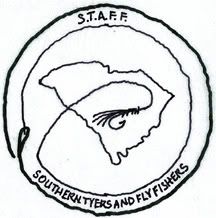
Alrighty folks… I been playing around with some photoshop stuff… I have 3 logos for the club… These are JPEGS and low res… Now keep in mind these are really just ideas on how they could look… We’d really need a REAL graphics dude that can make these right to get the quality and right look but it’s a start…
Logo #1

Logo #2

Logo #3

Talk it up and lets see if this one of these will wqork or at least inspire something better…
“Paddle faster boys… I hear banjo music!”
Charleston Director- SCKayakfishing.com
Tarpon 160os

I must be gettin old. I like the first one better. I would only change it by putting in some salty lowcountry patterns, Maybe a copperhead and a clouser, or even an M4. Maybe also a star on charleston to illustrate that this is a lowcountry based club.
I think they are all pretty ■■■■ cool.
Thats what I was trying for on the 1st one… there actually is a star on Mt Plesant  it’s just so low res so it’s not giant on here… It really needs to be a simple as possible so it will re-produce well on T-shirts and stuff so I tried to not use too much details… like I said we really need a graphics guy who can do all this in illustrator or something…
“Paddle faster boys… I hear banjo music!”
Charleston Director- SCKayakfishing.com
Tarpon 160os

but by one of each fly (fresh and salt) we open it up t more afflicted souls…i like the 1st one too. cant wait to vote on these. that’ll be fun. hootch has a few comin too i think
www.flyfishingsc.com
but by one of each fly (fresh and salt) we open it up t more afflicted souls…i like the 1st one too. cant wait to vote on these. that’ll be fun. hootch has a few comin too i think
www.flyfishingsc.com
I like number one too but it needs to be more smooth and less old folksy.
Every piece of tail you turn down is a piece of tail you didn’t get.
xHCFKx
Those are sick! One is bad ass.
“My fish served a whole lunchon. Your fish look like a munchkin”
196CC Tidewater 2008
Suzuki 115 2008
2007 Toyota Tundra TRD 5.7L V8
I agree ScottyD… I used a popper for the fresh and the pseudo clouser for the salt… GMTA  I also agree wiht you Rap but the more detial you get the harder it is to get it look good fon t-shirts and stuff… I tried to keep it as simple as possible… Keep the ideas comin ya’ll… If we don;t hav e a graphics dude amongst us I’ll see if I can recruit one fomr work here that may help us out…
“Paddle faster boys… I hear banjo music!”
Charleston Director- SCKayakfishing.com
Tarpon 160os

Nikon great job those look awsome… I really like the first one with some boarders and such in the hards of a professional we could make it look sweet… I have a graphic designer making a few but it is pro bonno so he is not in any hurry.
Pathfinder 1806
90 Yamaha
Things to keep in mind.
I love colors, but every color is a separate plate charge for screen printing. Plate charges vary from one printer to another. Least I’ve heard lately was $20 / plate.
Every color adds cycle time and cost to screen printing
With that said, #1 in 4 color would look SWEET. A decent quality T would cost about $20 in 4 color, about $15 in 1 color
Ditch the periods in STAFF… my .02 only YMMV
There is nothing - absolutely nothing- half so much worth doing as simply messing about in boats. Kenneth Grahame
Thanks guys all the input will help… TB what is YMMV???
“Paddle faster boys… I hear banjo music!”
Charleston Director- SCKayakfishing.com
Tarpon 160os

I’m down for #1, as long as it gets cleaned up. I guess I’m getting old, but I’m not a fan of the skulls in #2 & #3.
I vote for Chatahoochee’s avatar.
but sirisly, the layout of 1 is good but you should use some original art to give it more personality. I’ll volunteer some penwork once you’ve established the overall look.
here’s an idea too:

just a quick sketch there, would use a CAD for a final in any case to get the lines crisp
http://byersdesign.blogspot.com/
quote:
Originally posted by nikonjedi
Thanks guys all the input will help… TB what is YMMV???
“Paddle faster boys… I hear banjo music!”
Charleston Director- SCKayakfishing.com
Tarpon 160os

Your Mileage May Vary
There is nothing - absolutely nothing- half so much worth doing as simply messing about in boats. Kenneth Grahame
I like it Flats!
“Fishing is alot like sex…when its good,it’s really good, and when its bad, its still pretty good.”
Get rid of the periods around STAFF, add some more mend to the line as it lays across the state, bring back one of the fly rods and make the fly all salt, like a copperhead/crab pattern. Options would be to make the fly larger than the state so you wouldn’t have so much dead space/color or have it hook the state on the bottom corner (Georgia border).
“The good fisherman is surprised when he doesn’t catch fish: I am just the other way around.”
Gene Hill, Passing a Good Time.
is it too late to change the name to Southern Tyers & Flyfishers Unlimited? Better acronym 
I should probably go to a meeting before I start making suggestions though. 
http://byersdesign.blogspot.com/
I can see it now. … . .What meeting are you going to? STFU
“Fishing is alot like sex…when its good,it’s really good, and when its bad, its still pretty good.”
ill call her and ask …ha ha ya right
Pathfinder 1806
90 Yamaha


